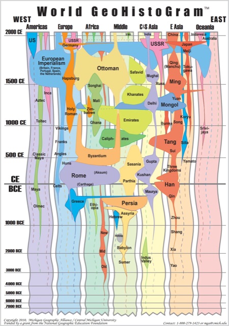
The World GeoHistogram combines geography and time into one unified visual framework that details the rise and fall of empires.
The diagram is composed of vertical columns representing broad world-geographic regions (i.e., Americas, Europe, Africa, Middle East, Central and South Asia, East Asia, Oceania). The vertical axis is time, and it is “tilted” so that time periods closer to modernity have more space and prominence.
Finally, the world’s biggest empires are plotted on the visual timeline, similar in spirit to the Histomap. Not only can you see the size and loose extent of an empire, but you can also use the GeoHistogram to make parallel connections between them that help tell the story.
The World GeoHistoGram is a useful simplification, but its structure inevitably leaves out many societies that don’t fit the “large, literate empire” model.
Civilizations without centralized states, written records, or expansive territorial control—such as many Indigenous cultures in the Americas, Sub-Saharan Africa, Oceania, and the Arctic—are largely absent.
Likewise, influential nomadic confederations, regional city-states, and complex oral-tradition societies receive little or no representation. As a result, the GeoHistoGram can unintentionally reinforce a narrow view of world history that overlooks diverse, sophisticated civilizations outside the traditional imperial narrative.