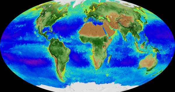
By monitoring the color of reflected light via satellite, NASA scientists can determine how successfully plant life is photosynthesizing. A measurement of photosynthesis is essentially a measurement of successful growth, and growth means successful use of ambient carbon.
This data visualization represents twenty years' worth of data taken primarily by SeaStar/SeaWiFS, Aqua/MODIS, and Suomi NPP/VIIRS satellite sensors, showing the abundance of life both on land and in the sea. In the ocean, dark blue to violet represents warmer areas where there is little life due to lack of nutrients, and greens and reds represent cooler nutrient-rich areas.
The nutrient-rich areas include coastal regions where cold water rises from the sea floor bringing nutrients along and areas at the mouths of rivers where the rivers have brought nutrients into the ocean from the land. On land, green represents areas of abundant plant life, such as forests and grasslands, while tan and white represent areas where plant life is sparse or non-existent, such as the deserts in Africa and the Middle East and snow-cover and ice at the poles.
This Mollweide projected data visualization shows 20 years of Earth's biosphere starting in September 1997 going through September 2017. Data for this visualization was collected from multiple satellites over the past twenty years. 20 Years of Global Biosphere https://svs.gsfc.nasa.gov/4596#.Wg9mHUys0-8.twitter